======
Comics as Music
The 116th meeting of the NY Comics & Picture-story Symposium [was] held on Tuesday, February 24, 2015 at 7 pm at Parsons The New School, 2 West 13th Street, in the Bark Room (off the lobby). [It was] Free and open to the public.
Frank Santoro on “Comics as Music: borrowing compositional strategies from music and applying them to comics.” Frank Santoro [did] present works from various cartoonists to illustrate how comic book layouts can be thought of in musical terms.
===========================
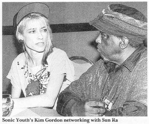
"A lot of artists listen to music while they work, and many think, Why can't I make art that looks as intense as the sounds I'm hearing?
I don't have an answer. --Kim Gordon, Girl in a Band
If you are interested in the correspondence course for comic book makers please email Frank Santoro here: santoroschoolATgmailDOTcom. I will send you a link to the private blog and you can check it out.
For those of you new to comics - maybe check out some great authors HERE.
George Lucas visual literacy lecture excerpt
Sun Ra a Joyful Noise
Sun Ra Space is the Place live
Lightning Bolt live
========
=======
======
=====
Very simply - most comic book formats revolve around these two basic proportions. The 2:3 ratio rectangle and the 3:4 ratio rectangle:

The 3:4 ratio is one that can, astonishingly, be broken up into 44 basic yet "perfect"variations (below) and then in combination up to 892 unique variations. Very comic book layout-like, no?

====================
I began looking at comic book formats - a rigorous investigation of the basics.
Traditional North American Comic Book (below) - the 2:3 grid:

===========================================================

========================================================

=========================================================
2:3 grid (below) - this is the live area of a traditional north american comic book:

==========================================================
Traditional Bande-Dessinee Format - the 3:4 grid - also more or less traditional North American Magazine format (below)

========================================================

=====================================================
Traditional Manga format (below)

===================================================
Manga format is a 2:3 "live area" within a 3:4 overall page size

====================================================================
Traditional North American Comic Book Format (below) is well suited for 3 tiers

==============================================================

===================================================
What's interesting to me is how common it is for artists to "open up the center" of a fixed grid:

===============================================================

=================================================================

============================================
============================================================
Traditional Bande Dessinee or Magazine Format is well suited for four tiers (below)

===========================================================

=================================================================

=================================================================

=====================================================
BD / Magazine size is, again, a 3:4 grid proportion so it fits 12 panel grids nicely:

=================================================
Here's an example of a BD size four tier arrangement - that doesn't stay in a fixed grid:

==================================================================
Look at how Herge is addressing the center of the page - and dealing with the center of the "top square" and the center of the "bottom square" (more on top, center and bottom squares) later. For further reading see Layout Workbook series:

==============================================

===============================================================
Old comics from the 1950s were a little wider than modern comics. Here's an example of four tiers that is between comics and magazine size:

Again what's interesting to me is how common it is for fixed tier comics to "open the center" somehow.
====


====================
Mapping images with geometry is what French masters like Poussin did:


=====================
Mapping comics pages seems to come natural for a classically trained artist like Hal Foster:


Hal Foster "maintains" the center is almost all of his early strips:

Here I'm just showing the "bottom square" arrangement of ley lines:

========================
What about cartoonists who "don't use the grid" or most likely just go "by feel"? Ben Katchor's Hand Drying in America is a collection of comics that doesn't use basic grids - yet I believe that Mr. Katchor has an intuitive understanding for spatial proportions - much like a musician who composes "by ear":

The live area for the majority of the one page comics in the collection are slightly irregular squares. This is the grid map template that I made from "finding the squares":


===============
=============
==========
I simply see the "invisible grid" that exists underneath as a guiding principle. Intuitive "by eye" makers can simply use the grid as a way to help see visual harmonies that exist. It's the same in painting - often the intuitive is in line with what is harmonically "correct". Same in music - composing "by ear".
I started thinking that organizing the page was similar to organizing notes within sheet music - the square creates a lattice of whole notes, half notes, and quarter notes to my mind. And the way of finding one's bearings was to map the squares on the page:


Thinking about the squares on the page and basic layouts I began to see the spread - not just the page - as the "bar structure".
Again - there are basically 3 standard sizes in Comics.
North American traditional mainstream comics - basically a 2.3 grid

French BD or magazine size - basically a 3.4 grid:

and Manga - basically a 2.3 grid in a 3.4 grid:

Lets talk about centers again - remember this:

So the 3 panel grid and the 9 panel grids have true "centers" on the page:


======================
======================
COMICS AS MUSIC
Thinking about comics as music started for me with Storeyville. I fixed the tier and panel size - and had a center panel. I thought of the grid as the drums. The grays as the bass. The colors as the "second line" of horns. And the black lines as the lead instrument - like a trumpet. Mostly I was thinking of New Orleans jazz from the early 20th century. The polyphony of the playing. Sometimes they all play together and sometimes apart - but always supporting each other - weaving in and out. Read an excerpt of Storeyville here.

I didn't "map" Storeyville out like I did Pompeii. It was just intuitive - however the fixed grid provided a sort of invisible architecture.
=============
Cold Heat was a traditional comic book format and ratio. This is where I began "mapping pages" like I used to map paintings like Poussin. I was also thinking about "synthesia". From what I understand pink and blue are like the notes E and F (I know this varies a little) and a friend with synthesia told me Cold Heat sounded like Van Halen to him.


I would alternate page layouts within Cold Heat - but the "grid map" underneath held it all together. Still I was frustrated with the way I would often "give up the center" of the page when I would use basic 6 panel or 8 panel grids.
========
I wanted to make a comic that "held the center" of the page. For the whole book. I've looked and looked and looked and there are only a few comics I've found that maintain the center for the whole book. 9 panel grid comics. Tezuka's first comic nearly has "open centers" on all the pages. Kirby would often employ a fixed 3 tier grid and often alternate between a 6 panel grid and the same arrangement with the center tier open. Many contemporary comics will use "widescreen" panels for pages at a time - but will usually at some point "give up the center". Of course there are comics that are "one panel per page" like old woodcut novels. But I'm interested in sequencing on each page.
"Holding the center" lead me to thinking and about modality in music. Very simply I wanted to have more expressivity through the limitation. However I didn't want the rigidity of an even grid. I wanted to use an "aperiodic" grid more like a Tartan pattern of parallel lines. Also, instead of the "prison" of chord changes I wanted panel arrangements which wouldn't have to resolve.
===========


I didn't draw the pages with a grid template underneath. I have just been "working" these proportions for so long that I feel like I "know my scales". I know where the sweet spots are. How to play horizontally - so the "melody" of my drawings is dictated by the "scale" of the layout. I think having an open center allows me to avoid basing my "melody" on the vertical "chord"of panel arrangements that use vertical panel boundaries. It not only interrupts the rhythm of the layout - the vertical panel demarcation creates a "chord" to my mind. It's something that needs to be resolved page after page. The rhythm of the panel layout and the "scale" dictates the melody. Even if that makes absolutely no sense - that my limited musical metaphor doesn't transpose the terms exactly--it makes sense to me as visual representation of modality. The whole book is "first take" or "second take". The rehearsal is the performance. I made a modal structure and let it go on and on. A beach to walk on where I can play expressively within the limitation - not a mountain of chord changes to climb up and down. Read more about process here.
please buy my book Pompeii here at Copacetic Comics
================================
=========================
==============
I emailed my friend Sreya who is a musician and asked for help with terms:
"For Pompeii, I chose the square to frame the tiers.
The vertical panel border - is most easily integrated at the fracture points - the half, third, and quarter again being the natural placement. Generally the horizontal tiers will remain fixed and the vertical panel borders will often change position to better accommodate an image.
In Pompeii, I didn't use any vertical panel borders - I chose to play "notes" on the "scales" of the tiers without playing "chords".
Does that make any sense at all?
I see the vertical panel border / axis - as a chord in some way - like the page has to resolve the chord every page, spread, if it introduces a vertical axis - especially if it moves to create different sized panels - the "fixed tiers" are like scales - horizontal endlessness - like walking on a beach - no chords to resolve - just notes over a scale - modal music - more expressivity within the limitation."
===============================
Sreya here: I’ll answer your question below as best I can. Forgive me if I'm telling you things you already know but I'll assume you don't have a knowledge of written music...
In musical notation, movement across the page relates to time - how long a note or pause is held. A straight vertical line (like the edge of your panel) would show the music divided into regular horizontal chunks indicating standard amounts of time.
These chunks of time are called "bars" - a set amount of beats or pulses that repeats over and over. A bar might contain anything from 2 to 10 beats but the most common are 2, 3, and 4-beat bars. Sometimes this indicates what kind of music this is i.e a waltz is in 3-time so it has three strong beats and you'd count it as "1, 2, 3, 1, 2, 3..." Most modern western music has 4 beats to a bar. Basically the number of beats is important as to the feel of the music and it shows the musician where to place emphasis - usually the first beat of each bar.
Pitch is denoted by the position of the dot up or down the rows. A chord is a collection of notes played at the same time and so on paper, would be denoted as a bunch of dots grouped horizontally. Therefore if you were talking about story being told across the page without panel breaks, I wouldn't think of it as a melody or chords being left unresolved as I wouldn't read this horizontally. It seems more a long passage of music which is not shaped in phrases but which continues on without natural pauses or a steady rhythm.
Hope that makes sense. Do let me know if you'd like any more information.
=========================
Frank here: Thank you for your response - I think I understand
However -when you write "Therefore if you were talking about story being told across the page without panel breaks, I wouldn't think of it as a melody or chords being left unresolved as I wouldn't read this horizontally. It seems more a long passage of music which is not shaped in phrases but which continues on without natural pauses or a steady rhythm." - it makes me think of how I do read my work "horizontally".
See Pompeii example spread - to me the left edge of the book - the center - and the right edge of the book - are the verticals that could be read as the "bar"
and within that bar I'm not using horizontals to upset that "timing". And then the images are the melody or notes within the horizontally moving "bar" structure.
Even if that makes absolutely no sense at all in musical terms - it is the way I thought of it to myself when I composed my book Pompeii that adhered to the set structure of the tiers - same as attached image - I mistakenly thought of it to myself as playing "scales" and having a simple modal 1,2 of big panels across the spread - and two sets of supporting panels - all playing together at once - so the horizontal reading to me is something I take into consideration. I think of pages with lots of panels as chords that need to be resolved - and a set structure I use as a mode.
Either way - what may be most helpful would be if you could possibly doctor my language so that when I explain it in front of an audience who may be familiar with musical terms I won't completely make a fool of myself.
===========
Sreya here:
"Each page can be thought of as a beat where a group of notes are being played simultaneously, represented by a number of panels. Together these notes form a chord - the greater the number of panels, the more notes being played and the more dissonant the notes are, forming an unresolved or clashing chord. Where there is just one large panel on a page, it represents a single note or a perfect chord where harmony is achieved and the musical phrase played over the course of the book is resolved."
Otherwise, you could just go with it as you have explained it below - while it may not be technically musical, you are speaking artistically and it may hold up to questioning better than what I have written above!
==================
===============
==========
MUSIC / ARCHITECTURE / PAINTING / GRAPHIC DESIGN
INTEGRATING SYSTEMS from other disciplines INTO COMICS.
Christopher Alexander's Pattern Language.
Le Corbusier's Modulor.
Sacred Geometry by Robert Lawlor.
I feel like how I apply music or architecture towards comics is expressed through graphic organization of images - and is like music and architecture founded on mathematical principles.
Comics, to me, is the "architecture of time and space". Just like music moves through time and a just like how a building is organized by space - comics deals in space and time and is expressed graphically. So using the "math" of classical proportions seems like an appropriate starting point.
======================
Chris Ware music metaphor - quotes from Comics Journal interview
groth: You know, talking about writing when you’re talking about comics is a little treacherous because I tend to think you write with pictures as well as words, so there’s no easy demarcation there.
Ware: Oh definitely. That’s what comics are. I think, like I said before, if you’re writing a script beforehand, you’re not really writing comics. You’re illustrating a story. That’s a generalization of course, and there are cartoonists who work that way. […]
groth: […] when you conceive of a story, do you think of it in visual terms or in verbal terms?
Ware: Uh… I don’t know I really don’t know, actually. I tend to think of it in all sorts of different ways. I guess more visually. I guess images flash into my mind, they might g et transferred into words. If I have something else and that occurs to me and I don’t want to forget it, I’ll write it down. I don’t know. […]
groth: You’ve made an analogy between your comics and the creative process in music. Which I think is a really fruitful avenue to explore.
Ware: […] when I started this ridiculously long story I purposefully tried to structure it in a “symphonic” way. I know that sounds arrogant and pretentious, but I wanted the story to be organized thematically, not organized in a plotted way. I wouldn’t even know how to do that. I don’t understand really what a plot is, because it doesn’t make sense to me in terms of real life. I don’t see my life having a plot. I see it as a lot of stuff that’s happened. Certain things seem to connect. But as far as the musical sense of comics goes, in 1988 when I first quit using words in my comics, and I decided to use pictures only, what I was trying to get at was that sense of unheard music in a comic. If you read any comic without words you’ll still “hear” something in your head. It’s not really like music. It’s not even really tones, it’s just a broken pattern of soundless rhythm. I had the inkling that these “sounds” were probably the root of what the real power of comics was: that sort of visual patterning that would then be reinterpreted as a perceived rhythm in the mind. […]
I’ve used an analogy before by comparing comics to sheet music. Comics are a series of symbols printed out on paper that represent a passage of events through time. In a way, you almost “play” comics in your mind like you might play a musical instrument. And there’s a certain sonority in the arrangement of panels, an internal logic to them, that comes out when you read them, that’s best described as “music”. Maybe “poetry” is a better word.
groth: You have said, “I want my strips to read like music, that is, create a feeling like music in your mind. And it would seem like your character is immediately alive as soon as you jump from panel to panel. I’ve heard other cartoonists talk about internal music.” When you compose a page, you’r trying to create a musical rhythm through the design and through composition of the panels.
Ware: Right.
groth: Would it be possible to walk l me through a page and tell me how you created a rhythm?
Ware:[…] In the case of the Quimby the Mouse strips, I tried to reduce the gestural quality of everything down to a series of a few lines. His body is simply a blob with arms, legs, and a head. There’s very little facial expression, actually. So I tried to get a sense of emotion just by the ordering of those sorts of limited motions. And I think it trained me in a way to do that more naturally, I guess, with drawings of “real” people.
groth: Well, it seems to me a pretty potentially fruitful way of talking about comics, as opposed to thinking of them cinematically which is almost too crude a parallel.
Ware: Well, cinema is rhythmic and musical at the same time too. There’s even more of an obvious rhythm to film, actually, because you sit back and let it wash over you. You’re “listening” to the performance. But in comics you have to perform the music yourself. I think a mistake that a lot of young cartoonists make is to not pay attention to that internal rhythm at all. When I’m drawing a comic, I read it maybe 200 times as I’m writing it. I start at the top of the page, and I read it over and over repeatedly to make sure that everything is harmonizing as well as I can make it. It’s a completely intuitive and nonintellectual act. If it doesn’t read right, or if the rhythm of it just doesn’t feel naturalistic or if it feels like the characters are acting as opposed to enacting or interacting, that’s when I go back in and try to change things. I’ll divide a panel into two to give it an extra beat or something. The only standard I try to use is the rhythms of daily experience.
=========================
=================
=================
============
============
=================
=================
=========================
I'm often asked "But what about the 8 panel grid that I also use for my correspondence course? That grid doesn't hold the center of the page."
Indeed. The short answer is that I am teaching a very basic comic book timing. Also I am interested in "modularity" of the 8 panel grid. An eight panel grid can be evenly broken up into a new format and still maintain integrity of timing. See below. Reorganizing a 6 panel grid would not work the same way.


Below is a spread of two 8 panel pages - I consider this a 4/4 beat:

Also, the 8 panel grid and rearranging it relates to how comic book "spreads" are broken up to be read as a scroll on the internet. Read abut scroll comics here. This also loosely relates to how old newspaper daily strips had to be 4 even panels or two even halves so they could run as a strip of 4 or a box of 4.


==============================================
OK - but what about when you're working with a writer and the script calls for a different number of panels for each page - and the size of the paper you are instructed to use is not a "classic" proportion. Funny you should ask! I did some layouts for a friend who does mainstream comics and it was a lesson for me - and proof that one can use template maps to help better organize a page so that all the pieces fit together in a "harmonic" and pleasant fashion.
Contemporary mainstream north american comics guide. Comic book itself is 6 and 5/8ths by 10 and 1/8th total area. The live area is a befuddling 6 an 1/8th by 9 and 3/4ths !!!!! It's as though the production people at the publisher just decided to arbitrarily make the live area roughly a quarter inch in from the edges of the book. Again traditional north american comics from about 1960 on used a 2.3 rectangle for the live area. The original art's live area was 10 x 15 inches (on an 11 x 17 board) and reduced to a printed live area of 6 x 9 within the 6 and 5/8th by 10 and 1/4th overall size. (Contemporary comics are often slightly shorter - by an 1/8th of an inch or so - than comics from 1960 to 2000 or so)
"Classic" 2.3 proportion of live area fit the margins "correctly":

I did some contemporary mainstream layouts at print size - here are my templates. Again this is 6 and 5/8ths by 10 and 1/8th total area. The live area is 6 and 1/8th by 9 and 3/4ths :
Simple top square, middle square, and bottom square template:

Thirds:

Quarters:

This template of "ley lines" is based off the center diamond and diagonals - it will help me find aperiodic parrallel horizontal lines:

Aperiodic horizontals template:

Simple circles with aperiodic horizontals:

5 panel aperiodic template:

Aperiodic verticals:

Aperiodic horizontals and verticals together:

more aperiodic verticals and horizontals:

=================================================================
So the idea - for me - in my practice - is a "holistic" approach to page layout. The systems above are very similar to the ones used in magazine and newspaper and now web layouts. Check out this book on grid systems for publication design: The Grid by Allen Hurlburt.

