Publishing history - Pompeii was originally going to be four 32 page books. But we scrapped that idea when the first book sold out quickly and the response was good. Dan and I just wanted to take the momentum and present the book as complete instead of as issues.
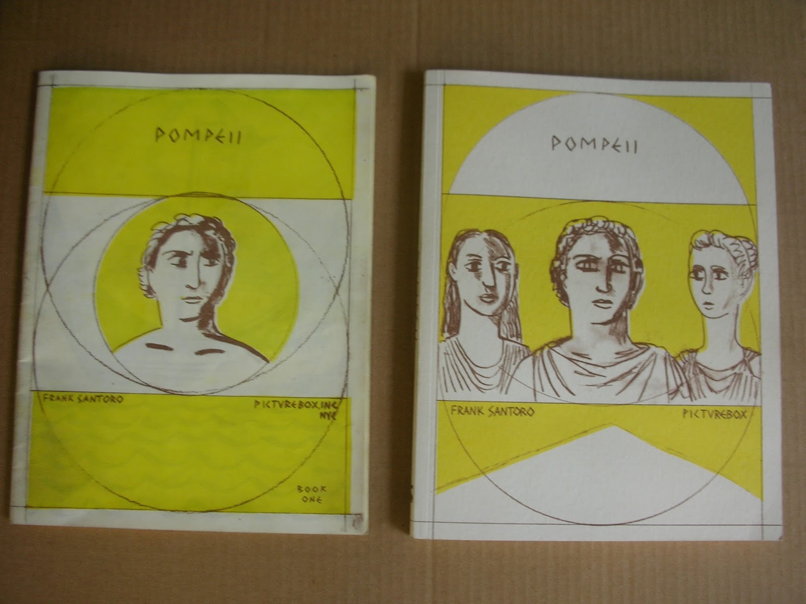
riso edition on left (below) was a little too dark - it washed out a lot of detail:

New edition right (below) is closer to the original drawings:

new edition on top - riso on bottom (below)

original drawing on top - new edition in the middle - riso edition on the bottom (below)

origiginal drawing on left - new edition on right (below)

original drawing on top - new edition on bottom - I'm very pleased with the reproduction


I drew the back cover on tracing paper - the pencil flows across the paper because it is so smooth (below)


I want to make comics that look good at the scale they are made - this spread (below) was drawn the same size it is printed here in the book. This would be a small drawing - 11 x 17 inches total for the two pages

The original drawing for the spread (below) - drawn the same size as it was reproduced


I want my narrative to read very easily, almost effortlessly - I'm going for openess and clarity here:


The drawing changes - the feeling of the scene is reflected in the drawing


Some spreads have thick lines and washes


Some spreads have thin pencil lines and little or no wash


I'm trying to frontload the making, the drawing has to have life -
and I'm changing scale and tools in order to create a tension between the different approaches

original drawing on left - printed page on right


