George Lucas visual literacy lecture excerpt
Moebius interview
art spiegelman interview
Full documentary Masters of Comic Book Art
Satrapi interview
Lynda Barry presentation
Lynda Barry on Late Night
Gary Panter interview
Raymond Pettibon interview
Jaime Hernandez interview
===========================
Frank Santoro process video
Cold Heat Comics
Motorway from Roswell comic
Frank Santoro interview
Pompeii process post
comics about parents
Sigur Ros video with Dash Shaw
please follow my tumblrs here and here
=========================
Christopher Forgues (CF)
Kramers Ergot
Sammy Harkham
===================
Barefoot Gen
Maus
Fun Home
Annie Sullivan
=============
Alex Toth model sheets
============
Dash Shaw's Bodyworld
==========
Sam Alden's Hollow
Gif based on Sam Alden's Hollow
=========
Format Fever - list of formats across the world
Thursday, August 28, 2014
Tuesday, August 26, 2014
Monday, July 7, 2014

Friday, June 20, 2014

Wednesday, May 7, 2014
Format Fever - more more notes
Here's a list of formats available to the comic book maker in 2014.
The template numbers on the following list are for templates used in my Correspondence Course.
Please email me santoroschoolATgmail for information.
1. comic book
2. mome / new love and rockets
3. french bd album
4. manga
5. trade paperback - think chester brown collections
6. american magazine size
7. standard digest zine
8. magazine ratio digest zine
9. mini-comic
10. tabloid
11. no format - web format - 920 dpi wide scroll - whatthingsdo / ny times ratio
12. movie screen
**The "no format" of webcomics is it's own subject. I am forefronting the WhatThingsDo aesthetic because it jibes closely with the current wide screen tv screen / movie screen aesthetic. I understand that most webcomics are thinner and incorporate headings, sidebars, etc - in that case one would "find the square" and create a system of periodicity for the scroll. See this post about scrolling.
===================
I think the most basic choices however are these three -in order of size:
manga (basically same size as most paperbacks) 5 x 7.5 inches
north american comic book (same ratio as digest zine) 6.5 x 10.25 inches
magazine size (basically the same as French BD) 8.5 x 11 inches - varies slightly
======================
But lets look at all of them:


FORMAT FEVER
1. comic book
2. mome / new love and rockets
3. french bd album
4. manga
5. trade paperback - think chester brown collections
6. american magazine size
7. standard digest zine
8. magazine ratio digest zine
9. mini-comic
10. tabloid
11. no format - web format - 920 dpi wide scroll - whatthingsdo / ny times ratio
12. movie screen
**The "no format" of webcomics is it's own subject. I am forefronting the WhatThingsDo aesthetic because it jibes closely with the current wide screedn tv screen / movie screen aesthetic. I understand that most webcomics are thinner and incorporate headings, sidebars, etc -
The template numbers on the following list are for templates used in my Correspondence Course.
Please email me santoroschoolATgmail for information.
1. comic book
2. mome / new love and rockets
3. french bd album
4. manga
5. trade paperback - think chester brown collections
6. american magazine size
7. standard digest zine
8. magazine ratio digest zine
9. mini-comic
10. tabloid
11. no format - web format - 920 dpi wide scroll - whatthingsdo / ny times ratio
12. movie screen
**The "no format" of webcomics is it's own subject. I am forefronting the WhatThingsDo aesthetic because it jibes closely with the current wide screen tv screen / movie screen aesthetic. I understand that most webcomics are thinner and incorporate headings, sidebars, etc - in that case one would "find the square" and create a system of periodicity for the scroll. See this post about scrolling.
===================
I think the most basic choices however are these three -in order of size:
manga (basically same size as most paperbacks) 5 x 7.5 inches
north american comic book (same ratio as digest zine) 6.5 x 10.25 inches
magazine size (basically the same as French BD) 8.5 x 11 inches - varies slightly
======================
But lets look at all of them:


FORMAT FEVER
1. comic book
2. mome / new love and rockets
3. french bd album
4. manga
5. trade paperback - think chester brown collections
6. american magazine size
7. standard digest zine
8. magazine ratio digest zine
9. mini-comic
10. tabloid
11. no format - web format - 920 dpi wide scroll - whatthingsdo / ny times ratio
12. movie screen
**The "no format" of webcomics is it's own subject. I am forefronting the WhatThingsDo aesthetic because it jibes closely with the current wide screedn tv screen / movie screen aesthetic. I understand that most webcomics are thinner and incorporate headings, sidebars, etc -

Tuesday, March 11, 2014
how to draw a pentagon
TRY ROBERT LAWLOR's PENTAGON CONSTRUCTION technique.

INCORPORATE THIS EXERCISE INTO YOUR DAILY WARM UPS

INCORPORATE THIS EXERCISE INTO YOUR DAILY WARM UPS
Tuesday, September 24, 2013
Pompeii process post
Pompeii started as me wanting to tell this story about working for Francesco Clemente. But that was too complicated. Too many modern details. Dash had been telling me I should make a romance and I had always wanted to do a riff on the genre. So I mashed up my classical influences - many learned from Clemente - and set the whole thing in Pompeii at the time of the eruption of Mount Vesuvius in 79 AD. Working for Clemente had that feeling of going into another world - so it felt right. Plus I could play out the narrative without explaining too much. Pompeii is like a genre in itself - like stories set around the sinking of the Titanic.
Publishing history - Pompeii was originally going to be four 32 page books. But we scrapped that idea when the first book sold out quickly and the response was good. Dan and I just wanted to take the momentum and present the book as complete instead of as issues.


New edition right (below) is closer to the original drawings:


original drawing on top - new edition in the middle - riso edition on the bottom (below)


original drawing on top - new edition on bottom - I'm very pleased with the reproduction

I want to address drawing - make drawing the subject matter. I made an artist who makes portraits my focus. I could play around with representation. This is the back cover of the completed edition (below)

I drew the back cover on tracing paper - the pencil flows across the paper because it is so smooth (below)


I want to make comics that look good at the scale they are made - this spread (below) was drawn the same size it is printed here in the book. This would be a small drawing - 11 x 17 inches total for the two pages

The original drawing for the spread (below) - drawn the same size as it was reproduced


I want my narrative to read very easily, almost effortlessly - I'm going for openess and clarity here:

I maintain a basic timing device and I never give up the center of the page

The drawing changes - the feeling of the scene is reflected in the drawing


Some spreads have thick lines and washes


Some spreads have thin pencil lines and little or no wash

They look really different when you put a thin line pages next to thick line pages:


I'm trying to frontload the making, the drawing has to have life -
and I'm changing scale and tools in order to create a tension between the different approaches


mostly I am thinking about scale, about value and about tone - about drawing


Publishing history - Pompeii was originally going to be four 32 page books. But we scrapped that idea when the first book sold out quickly and the response was good. Dan and I just wanted to take the momentum and present the book as complete instead of as issues.
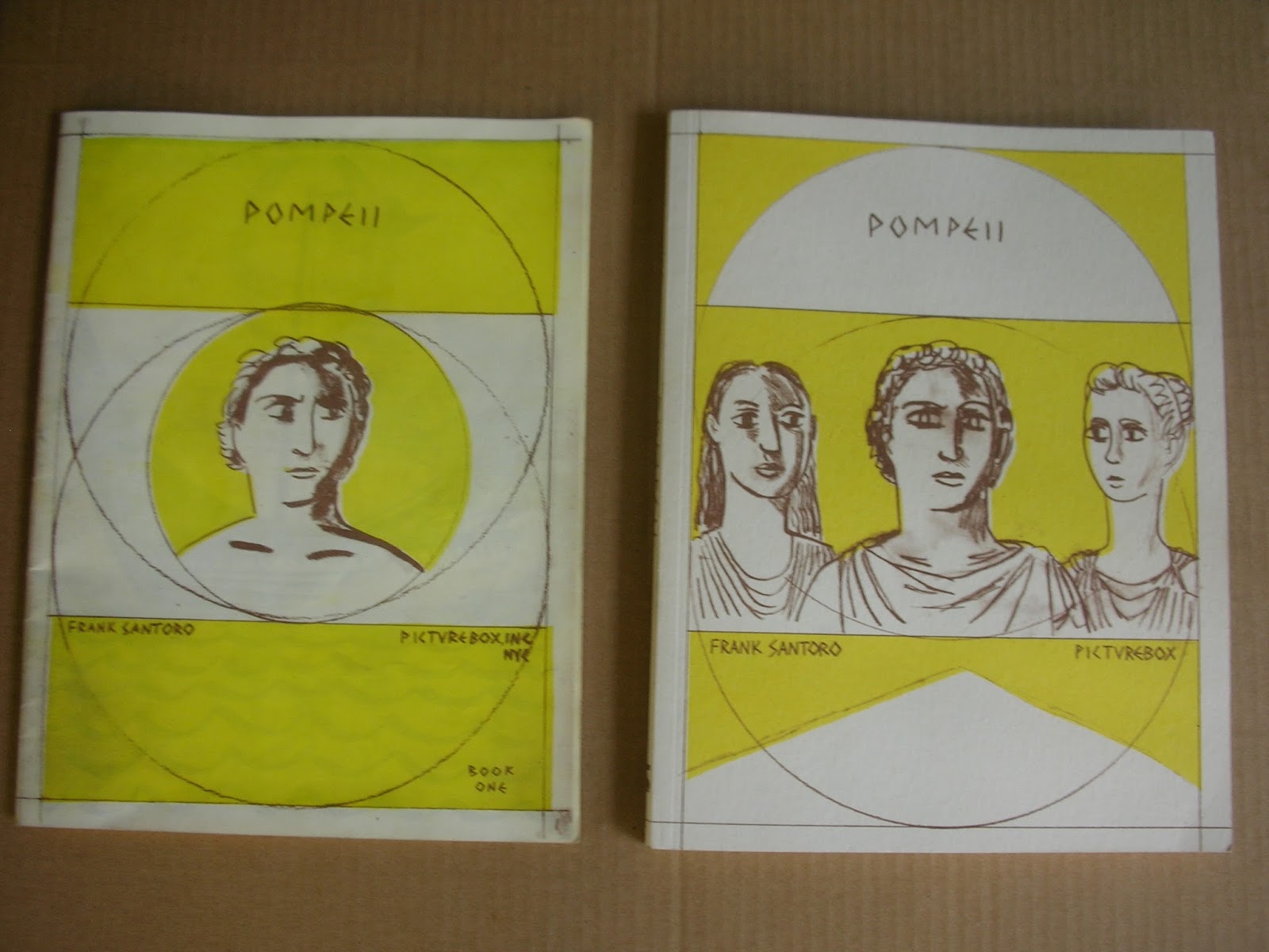
riso edition on left (below) was a little too dark - it washed out a lot of detail:

New edition right (below) is closer to the original drawings:

new edition on top - riso on bottom (below)

original drawing on top - new edition in the middle - riso edition on the bottom (below)

origiginal drawing on left - new edition on right (below)

original drawing on top - new edition on bottom - I'm very pleased with the reproduction


I drew the back cover on tracing paper - the pencil flows across the paper because it is so smooth (below)


I want to make comics that look good at the scale they are made - this spread (below) was drawn the same size it is printed here in the book. This would be a small drawing - 11 x 17 inches total for the two pages

The original drawing for the spread (below) - drawn the same size as it was reproduced


I want my narrative to read very easily, almost effortlessly - I'm going for openess and clarity here:


The drawing changes - the feeling of the scene is reflected in the drawing


Some spreads have thick lines and washes


Some spreads have thin pencil lines and little or no wash


I'm trying to frontload the making, the drawing has to have life -
and I'm changing scale and tools in order to create a tension between the different approaches

original drawing on left - printed page on right


Subscribe to:
Posts (Atom)